

brat and the ugly-chic green revival
why this viral color makes sense for a hyperpop feminist manifesto

what is this green?
lime? slime? chartreuse? mold? it’s an in your face green, a puke green, a rotting green, an underbelly of the human condition green. and it’s blowing up online. a color trend has been born. on reddit, people are asking for advice on where to find brat green makeup and nail polish. depop sellers—entrepreneurial as ever—now offer DIY brat green bows for $18. social media profile pictures are turning brat green en masse.
what makes brat green so conducive to virality? and why is the perfect color for charli’s hyperpop feminist manifesto?
i’ve been brat-pilled.
confession: i’m one of those newly minted charli xcx fans. before brat, i could not name a single charli song. also i don’t really listen to hyperpop or go clubbing so…yeah, it just wasn’t on my radar.
but when i saw it drop on spotify, something about the brashly simple arial-narrow-font-on-puke-green album cover made me want to listen. i was intrigued by the faceless image, a meme and a billboard and a home depot paint chip sample all at the same time. the ssense copywriters are gonna have a field day with this one, i chuckled. so i pressed play.
and i’m so glad i did. brat has grown on me. i will say that my love of the album stems more from the lyrics than the musicality, though i have found myself bopping my head occasionally to the distorted autotune beats. the writing is what feels profound to me. with ‘i think about it all the time’ she’s taps into our collective anxiety about whether or not to have a baby. and ‘girl, so confusing’ literally describes the emotional whiplash of every frenemy dynamic i’ve ever spiraled over. as a writer i try to write the way i would talk, capture the rawness and conversational tone…so i love that charli’s singing sounds like how she talks. vulnerability and truth are contagious. that’s the genius of the album. like yes, let’s talk about birth control and raging jealousy and overanalyzing our face shapes.
brat is the cultural kindling we needed to reignite the girlhood conversation and bring it to a new place.
just as the bow became the stylistic shorthand for girlhood, this specific shade of green is now associated with brathood and charli’s brand of aesthetic expression.
brat green builds upon the subversive legacy of prada’s ugly-chic concept
whenever green starts trending in fashion, i think of the collection that started it all: prada’s 1996 spring summer “ugly chic.” it’s hard to overstate how pivotal this collection was for its time, and its enduring impact today.
to set the stage, fashion at this time was all about 90s ultra sexy vibes. think tom ford era gucci, crisscross bikini crop tops, belly cutouts, slinky dresses, black and white. it was in that context that prada sent this down the runway:

her inspiration? homely furniture from the 1950s, the rotten avocado colored couches that adorned every suburban home. prada said she wanted to take the idea of “bad taste” and upend it via fashion.

so she created a collection focused on geometric prints, all in some sickly combination of green and brown. prada famously said that she loved those two colors due to their lack of “commercial” appeal. this feels like such an obvious, perhaps even belabored, concept in modern day but it was considered groundbreaking back then. so the collection became known as ugly chic, and that descriptor would dominate the public perception of the brand for decades to come.

i also love that she was kinda saying, fuck seasonal color analysis lol. these are sickly colors, visual symptoms of biological malady—jaundice, gangrene, etc. i don’t care if you’re a fake autumn or a true autumn, here’s a bilious sludge blazer. enjoy! brat mentality.
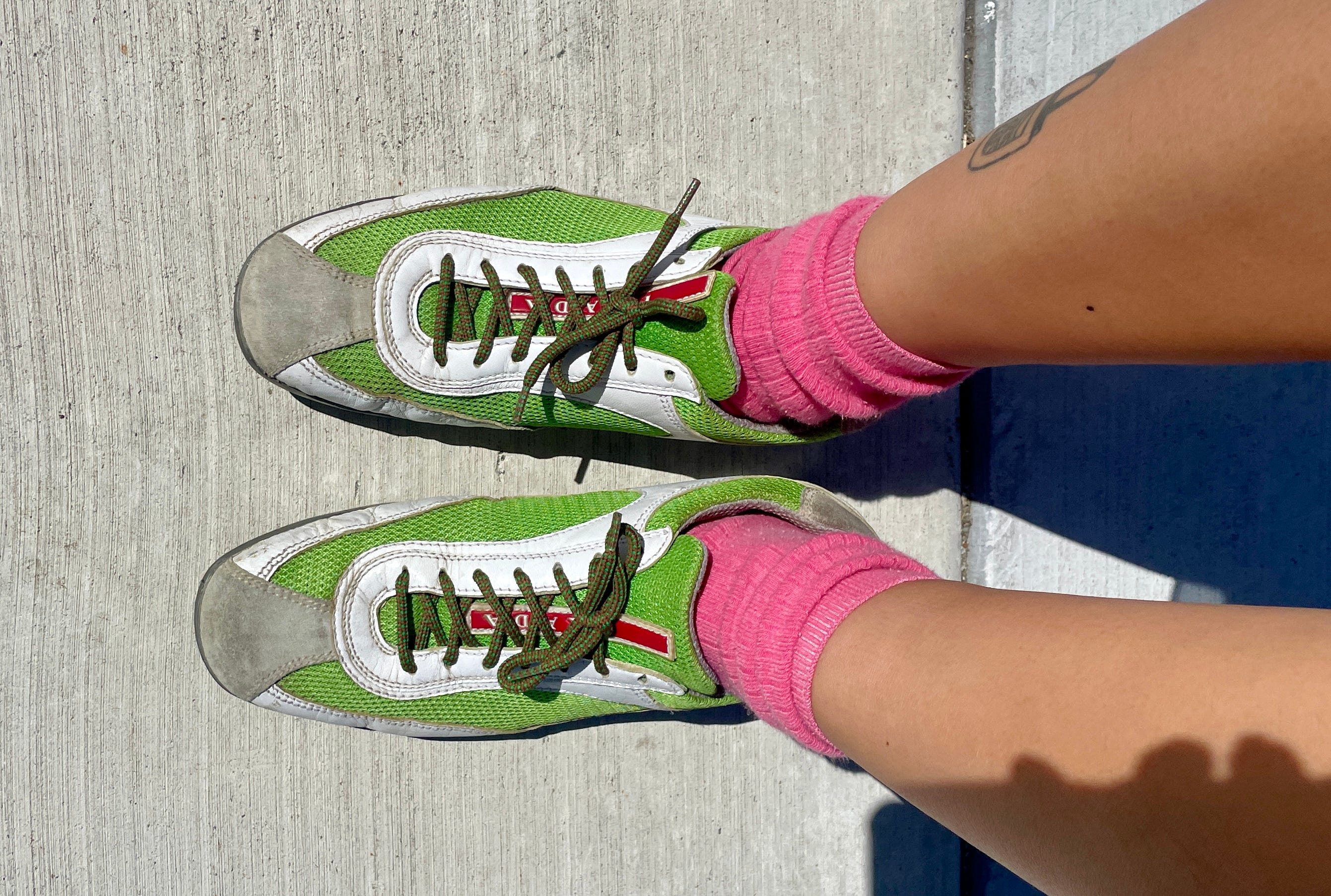
based on my experience hunting down vintage pieces from these brands, it’s easy to come across a cardigan or knit polo that’s clearly referential to ugly chic green. the actual 1996 pieces themselves are trickier to source though…i managed to find the geometric skirt on vestiaire though!
by the way, there’s only one other pair of the prada sneakers from the cover photo i could find online (size 6.5). please let me know if you get them, we’ll be sneaker twins.
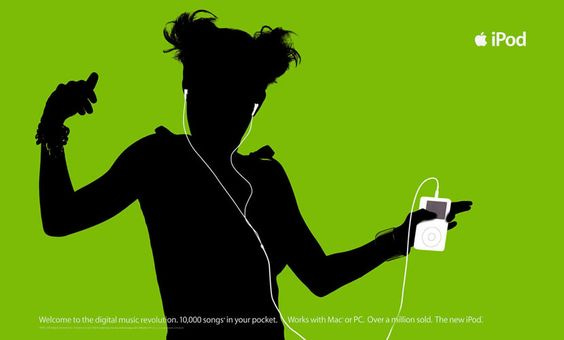
brat green evokes the color of early 2000s tech
the album cover instantly reminded of the 2003 ipod ads. these were so good…the crisp silhouettes dancing against a saturated flat background, the white of the earbud wires. this color was called ‘limewire,’ and it was part of the popular candy-colors that dominated this era of technological innovation.

my first phone was a motorola razr. it was gray…boring, i know. i had it for all of one month before i carelessly went to pee one day while the phone was tucked in the back pocket of my low rise bullhead jeans. plop! it fell into the toilet. so then i had to save up red envelope money to buy another.
anyways, i remember this lime green was a very popular color for razrs.

you know how iphone users text each other and the speech bubble is blue, but it’s green for non-iphone users? yeah. it’s like the color of being a little more offline than the average person.
charli is 2 years older than me, so i feel like we grew up in similar technological landscapes. the references just feel vivid.
brat green is the color of female villainy
consider the story of elphaba from wicked. green is meant to symbolize female jealousy and villainy (which the story unpacks from the “villain’s” pov). it’s also about two women who are pitted against one another, which reminds me of ‘girl, so confusing.’ charli’s album celebrates the “mean girls” and the “bad girls,” so it’s fitting that she would chose a color that has strong associations with female villainy. it makes sense given the themes of this album!

ok, more green bad girls…shego, the soft goth villainess of kim possible. the long dark hair looks very charli. also, two women who are portrayed as each other’s “nemesis.”

and my favorite cartoon brat, buttercup. she’s known for her rage, brashness and tomboy style, but also has a vulnerable side.

did i miss any brat green cultural associations? drop them in the comments :)
xoxo
viv
P.S. the winner of the j scent perfume is Kelly LH Inouye! I’ll send you a message to coordinate shipping. thank you!
buttercup is so brat coded!!
i love that this color has people’s attention right now. it’s so bright and fun and a little ugly in the best way.
i think the album as a whole is a fun juxtaposition of how barbie and pink were omnipresent last summer.
i was also getting a little green screen – an empty expanse that everything and anything can be projected upon