Happy Friday! A few notes before our feature presentation today:
Can’t get enough of bag charm discourse? I was interviewed by Marie Claire on why stuffed animal bag charms are trending. You can read the article here. Aside from the emotional support explanation, I attribute the proliferation of plushie accessories to the growing influence of Korean and Japanese soft power on Western fashion tastes.
When I heard about the United Healthcare CEO assassination, I immediately thought the movie I Care A Lot (trailer) starring Rosamund Pike of Gone Girl fame. It’s a girlboss-ian dark comedy who uses the American healthcare/legal system to exploit the elderly and get filthy rich. Let’s just say it lowkey foreshadowed what happened this week, and also delivers a critique of America’s deeply violent healthcare system that puts profit over people every day. Highly rec for a weekend watch—plot moves fast, you won’t get bored.
I finally ordered a Justine Clenquet choker [affiliate disclosure] on sale after months of admiring my sibling’s Clenquet dangly earrings. My overall jewelry collection leans “elegant” and I’ve found myself wanting some tougher chain shapes (do you have recs?). This will layer well with my treasured Casa Spratling Cascabel chain.
My friend Cecilia of studiosecondsight put together this database of small businesses supportive of Palestine. To add yourself/your biz, email studiosecondsight@gmail.com :)
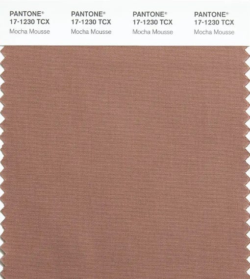
“Mocha Mousse” is Pantone’s 2025 Color of the Year.
I hate it.
Well. I don’t actually hate the color itself, which is really just SAD BEIGE beneath the mousse turd branding. It’s not my favorite, I wouldn’t wear it, it’s meh, it’s just…sad beige. Like those Werner Herzog baby toys that rich white milennial parents really like (bc bright colors are *garish*).
What I really hate is that it’s the Color of the Year, which is a highly calculated business decision above all else.
This decision influences consumer trends, which in turn can advance cultural and political agendas (i.e. tradwife aesthetics were not an innocuous joke etc etc). After digging into the campaign, I think Mocha Mousse is just really…regressive. It feels like they just took 2024’s “Peach Fuzz,” went one shade darker, then slapped on the mocha branding to make it seem luxe. It’s still sad beige.
For me, the color does not stand for anything comforting, aspirational, or hopeful. Rather, it represents the cowardice of neutrality in a cultural moment when we cannot afford such passivity.
If you’ve been reading The Molehill for a hot minute, you know that fashion is a lens to understand the sociological phenomenons around us. Color, when branded into a code of values, is no exception. We saw how Brat green dominated the summer with its irreverent party-girl connotations (then it became co-opted by the Democratic establishment and quickly lost its cool).
This is NOT a critique of the color brown, or its inherent aesthetic value.
This IS a critique of the way Pantone chose to brand and assign meaning to a shade of brown.
So, what can the storytelling around Mocha Mousse tell us about where consumer culture is headed?
Here’s how the Pantone website copy introduces us to the Color of the Year: