

farm to table to closet
fall color combos inspired by an unexpected source: the kitchen cabinet.

Today’s newsletter is sponsored by East Fork Pottery 🥣
The doorbell rang.
Our first guests were arriving for a movie night hang, and I was in the kitchen putting final touches on the cheese board. More guests trickled in, bringing bags of chips and popcorn that started piling up on the counter, so I pulled out two big bowls to transfer the snacks into.
Immediately, a guest clocked the matte speckled glaze—”is that from East Fork?” I nodded and laughed, and we bonded over our mutual obsession of the colorful clay vessels. Another guest floated over—”wait, are you guys talking about East Fork? I’m working the Emeryville sample sale next month.”
Throughout the past 10 years or so, East Fork has flooded the kitchen cabinets of Bay Area home cooking enthusiasts, including my own. These households usually have a copy of Samin Nosrat’s cookbook, jars of dill and cilantro sitting along the kitchen window, and the bi-color insulated Berkeley Bowl/Monterey Market tote bags.
Farm to table runs deep in our regional food culture, and that translates into a preference for eating off earthy clay forms rather than scalloped-edge porcelain plates.
When I was in my early 20s deciding where to buy my first real “adult” dinnerware set, the main reason I chose East Fork (aside from the durability) was the variety of color options. I’m not the kind of person who needs all their dinnerware to match…in fact, an all-white set of plates sounds really depressing, to be honest. So I bought two pink dinner plates and two lilac soup bowls (both old seasonal colors).
From there, my collection grew and I now have a rainbow of pots in my kitchen cabinet. While they’re functional objects I use daily, they’re also an unexpected source of styling inspiration!
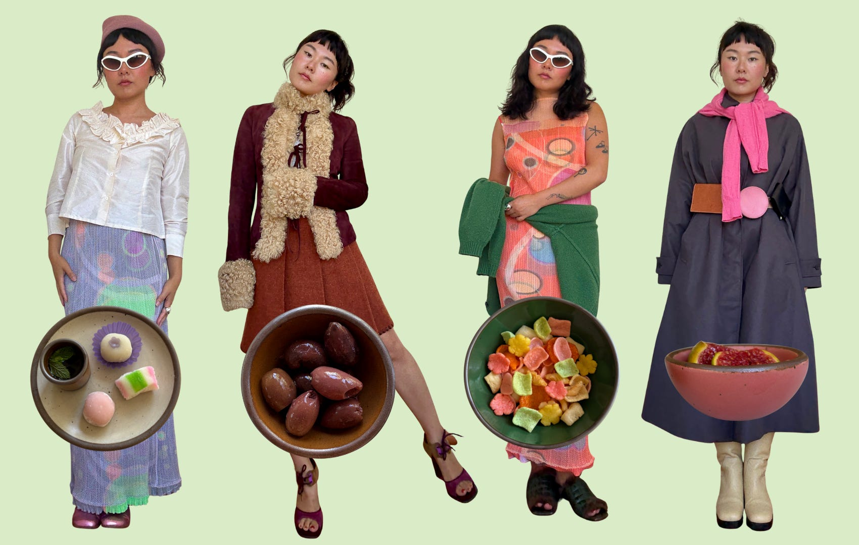
I came up with four fall color combos inspired by East Fork’s newest colors. Consider it an exercise in farm to table (to closet). Here’s the lineup:
Malachite: polished gemstones, waxy leaves, the glow of a banker’s lamp. A glossy, saturated green that feels lush and full of mystery.
Sepia: worn leather, barrel-aged bourbon, vintage photographs scribbled with years. A warm, glossy brown that wraps you in comfort and nostalgia.
Guava: sun-ripened fruit, rare blooms and Havana at dusk. A velvety matte pink that hums with late-summer heat and lush, tropical abundance.
Malachite + Goldfish Orange
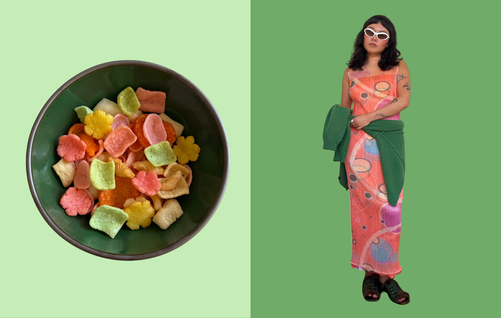
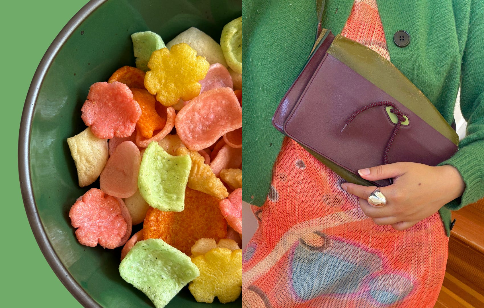
Green and orange are complementary colors, so this pairing exudes a certain chromatic electricity…a crackle and a fizzle. Not unlike the festive spirit of these assorted Japanese puffed rice crackers. They come in bright colors that give the illusion of variety. If I close my eyes, they all taste the same. But I swear that the pigmented orange and pink crackers taste sweeter than the beige ones…
Orange is a highly underrated color. It has its trend moments, but I can’t recall the last time it claimed a cultural moment—not in the same way as millennial pink. Anyways, wear your oranges with your greens and you’ll unlock a *mallard duck in Golden Gate Park* vibe.
Here’s a detail shot. I love the way the deep green contains the confetti chaos of the citrusy colors in both photos.
How I use this form: the popcorn bowl is a kitchen workhorse. On a typical weekday lunch, I mix all my salad ingredients in there (usually some shredded rotisserie chicken, canned chickpeas, and whatever seasonal produce is in the fridge) and eat it in the backyard if the sun is out. I like the sensation of its weight on my lap, the way the curved edge comes up so high I can hug it with my palms. And true to its namesake, it’s the go-to bowl for party snacks.
Sepia + Kalamata
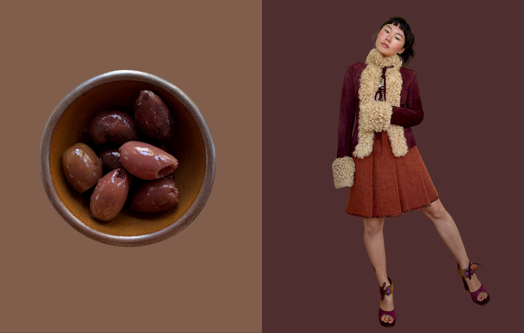
Given that September just started, we’re about to see sooooo many tonal brown outfits. I love it. The tonal effect is very 70s, especially when you factor in something shearling/fluffy-textured. For this color combination, I was inspired by a jar of kalamata olives in the fridge. Every olive is brown, but each one is ever so slightly a different shade. They’re smooth and glossy like the bowl.
For outfits, I suggest pairing a warm reddish brown with a darker, almost purple-y kalamata brown. I’m not wearing any jewelry here, but some gold rings would add a nice dimension. This is something I’d wear for dinner and drinks in Temescal.
How I use this form: the bitty bowl is for literally any snack or condiment that will fit. Olives, wasabi, hoisin sauce, salsa, kimchi, the list goes on. I also sometimes use these for holding rings and jewelry!!! They make a thoughtful gift for a friend.
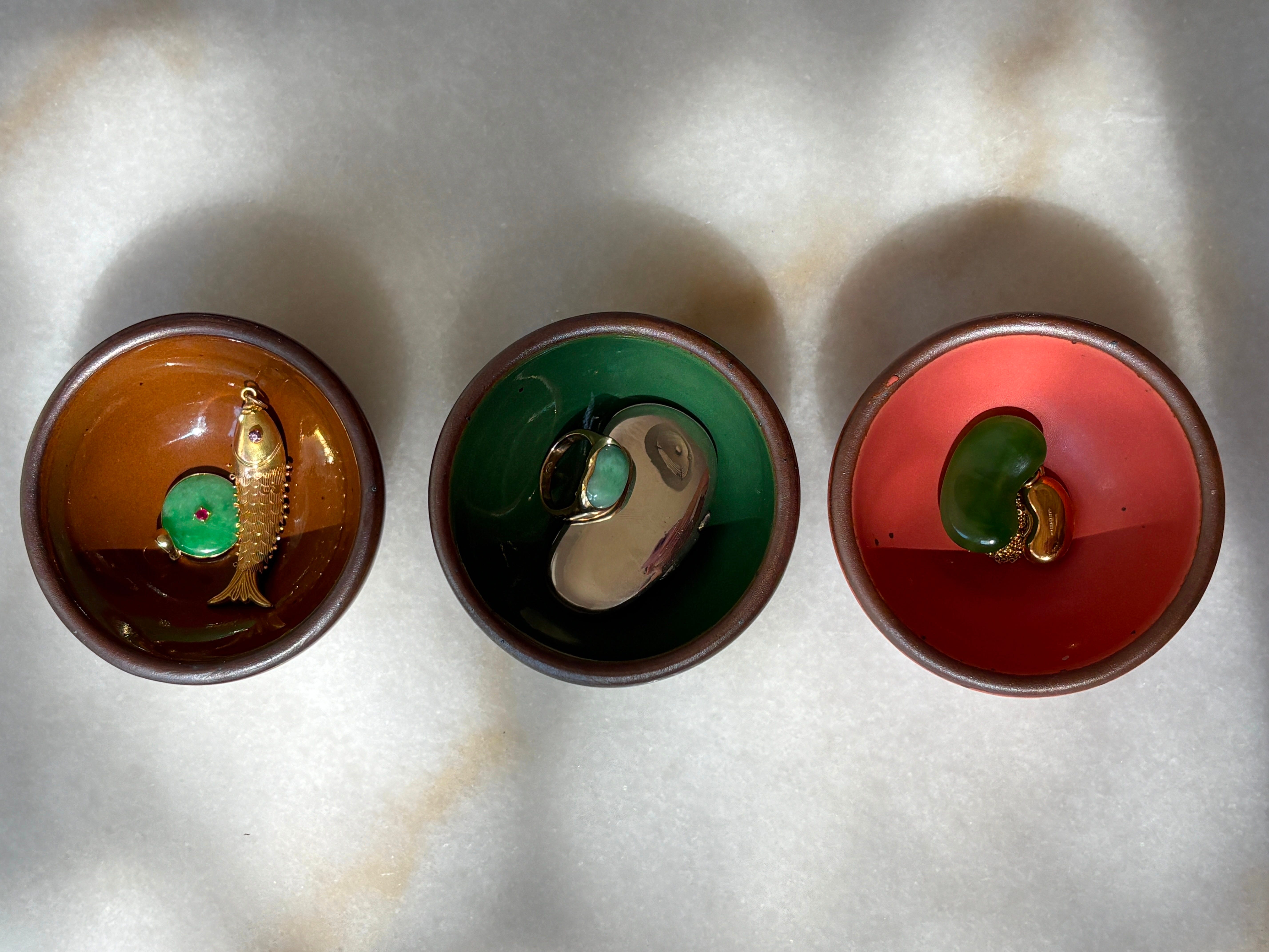
Here’s how my jade jewelry looks in each color:
Guava + Sepia
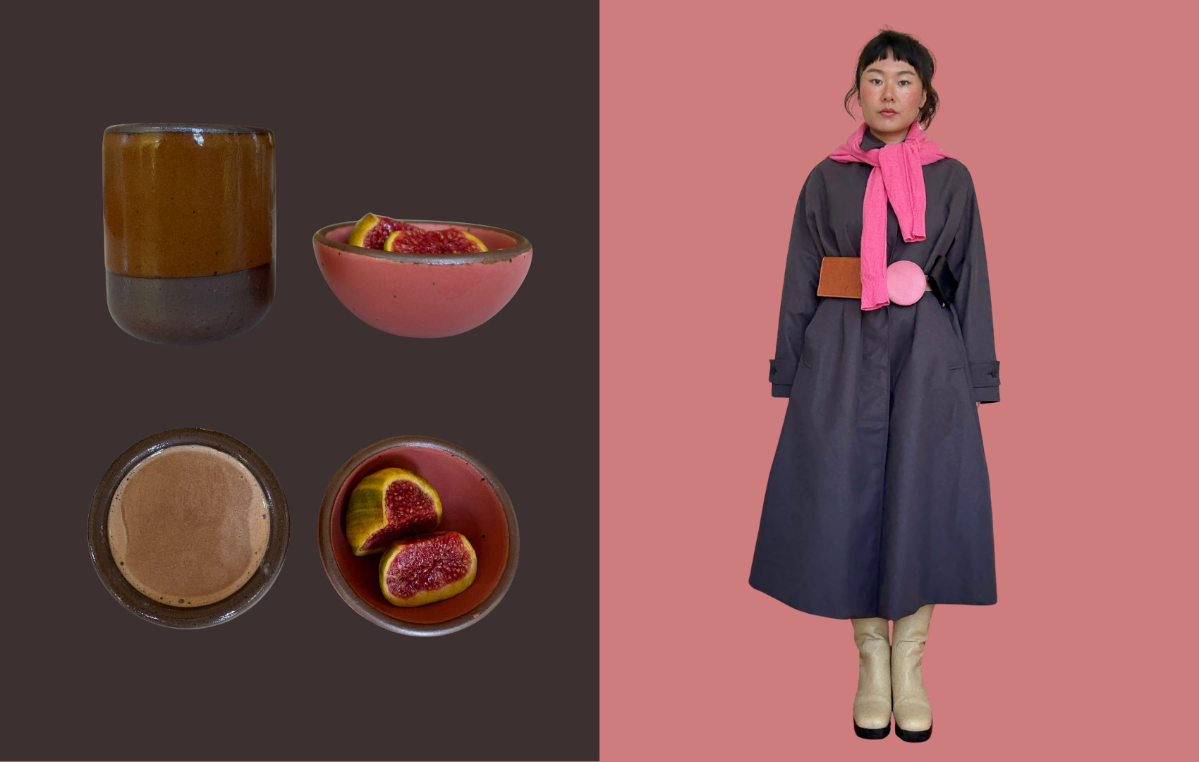
I couldn’t skip an opportunity to talk about pink and brown! This has always been a nostalgic color combo, especially for those of us who grew up with in the 2000s and associate it with Juicy tracksuits and Coach purses from that time. Nowadays, shades of pink and brown remind me of the Southwestern landscape. Craggy rocks, desert dust, and blushing cactus fruit.
This belt is one of my most prized possessions. It’s made of three sliding pouches in different geometric shapes and colors (pink, brown, and black). It adds instant visual interest to a “tent” shape dress/trench. Vereverto doesn’t exist anymore, but it was one of those small slow fashion brands I’ll never forget and you can still find pieces on Poshmark (I shared this belt bag in brown in the chat this week).
How I use this form: the tiny cup is made for your sipping pleasures. Great for sake, teas, or espresso. (I had a chocolate milkshake with candy stripe figs…random combo I know but it hits!!).
Panna Cotta & Periwinkle
*Panna Cotta is one of their core collection colors and looks great with everything.
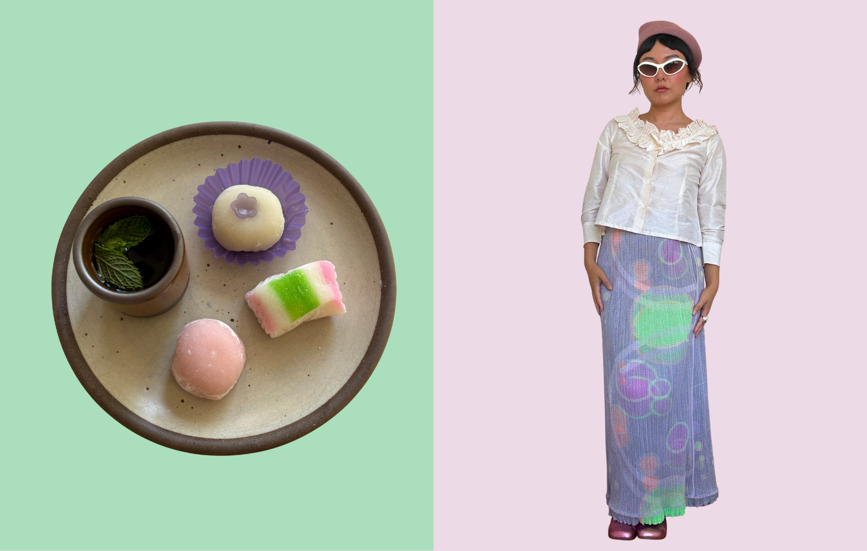
I used to hate pastels. But in the past year, I think I’ve figured out how to wear them without looking like a washed out Easter egg. And the key is to treat it the way a food stylist would treat mochi.
Because of its rice flour composition, mochi is generally pastel-colored—powdery, faint, diffused with a certain lightness. A tray of mochi looks best when its delicate qualities are showcased with carefully pleated wrappers, freckles of rice flour, or a semi-transparent flower embellishment.
The lesson? You have to handle pastels with care. A light touch goes a long way.
This periwinkle Issey Miyake skirt was a holy grail piece, and I sourced with the help of a UK-based reader who helped me as a Vinted proxy! At first I struggled to style it…up close the colors and prints look busy and maybe even cacophonous, but when you step back you see that it’s actually a vibey atmospheric symphony. I like styling it with this creamy “cupcake wrapper” blouse and a suede pink beret that resembles the powdery roundness of mochi.
How I use this form: it’s my everyday plate. In the morning, toast and eggs. Throughout the day, cut fruit, sandwiches, cheese slices, red bean mochi.
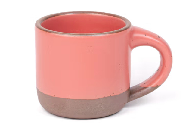
You can browse all the colors here. If I didn’t already have a full set of mugs, I’d order this one because it would look too good with my once-a-week matcha latte :)
I’d love to hear your personal favorite fall color combo in the comments!!! 🍏👛🧸
xo viv
Thanks for being here. You can find me on IG and TT. My wardrobe pieces and recs are saved here—unless it’s vintage, of course ;) I may earn a small commission from purchases made through affiliate links.


That coat w the belt bag?!? Brilliant, perfect
haven't even read this yet but visually, incredible. can we make this post an art installation